Sunday 17 April 2011

The Wallace Collection

When I read this question before seeing the collection, I assumed that I would not like the labels directly on the painting.  I thought they would detract from the artwork and that it was unnecessary to spoil the art with a label.  But once I saw them in the gallery, I actually liked them.  I did not think they ruined the artwork at all and actually thought they enhanced the viewing experience.  They all tried to match the gold of the artwork's frame and blended in quite nicely.  For me, the labels on the frame made it feel more like I was viewing these collections in someone's lavish home instead of in a sterile museum environment.  I also thought they fit the collection because they increased the grandeur of the piece and of the museum by not having awkward, stark white labels next to each painting.

My favorite piece from the collection was Gaspard Dughet's "The Falls of Tivoli."  I liked this painting because of it's serenity.  If I could imagine a place to escape whenever I wanted to relax and be alone to think, I would want to transport myself into the painting.  I think the sound of rushing water is one of the most calming sounds in the world.  I am also intrigued by the two people in the foreground.  I want to know why they are down below the waterfall when all of the other townspeople are standing along the beach in the background.

For the object that intrigues or disgusts me based on lavish detailing, I was originally going to do a picture of a feast that included three lobsters, but then I saw this clock.  It's not that I don't think this clock is gorgeous; it is definitely exquisite.  But I don't think I would ever want something like this in my home.  It's so unnecessary!  There is just so much gold and so much going on.  If I had this clock, I would constantly look at it to find out what time it was and never actually register the time because I would be so mesmerized by all of the detail.

 My favorite museum we've visited is the Science Museum.  It had so many different exhibits and was an enormous museum.  I've actually never seen a science museum quite like it.  Most science museums have exhibits about physics or electricity, but not about future environmental concerns or interesting current inventions.  The Science Museum in London had an entire exhibit on plastic, detailing its history and showing current inventions using plastic.  It also had a recyclable fashion exhibit, featuring fashion designers that use recyclable materials and their clothing.  I liked the Science Museum best because I had a lot of fun there.  I thought it was a really unique museum with tons of interesting exhibits.

I think I do have a greater interest in visiting museums after this course.  After seeing so many, I want to visit more and compare them to one another.  I was not previously intimidated by art, but I didn't find it as interesting as I do now.  Before this course, I would have never visited an art museum on my own for fun.  But now I would definitely seek out art museums and visit them.  I also enjoyed the part of the course about branding.  Whenever I visit museums of any type now, I always look at their logo and brochures and wonder if their font and designs fit with their museum's mission.  I would have never thought about logos and themes of museums before this course.

Sunday 10 April 2011

The Design Museum

 Architecture:  "Playing with Lego Bricks and Paper"
This piece was is cute, colorful and happy, mixing reality with fantasy.  I chose it for architecture because I think a town wall designed like this would be really fun and add character to the area surrounding it.

 Furniture: "Endless"
  This chair is amazing not only because it's made from recycled refrigerators, but also because it looks super stylish and modern.  I love the ribbons of color that run vertically through the chair in varying shades of white, cream and green.

Transport: "EN-V"

This car is innovative because it is only one-third the size of cars currently on the road.  It would help improve safety conditions on the road because the car uses social networking technology to talk with other vehicles and automate driving and parking.

 
Graphics: "I Wonder"
The book is interesting because when it is closed it feels like a solid block of gold.  I thought the designs on the inside were interesting and liked the concept of a design book that explores people's mundane everyday thoughts and musings.

Wim Crouwel:
I liked Crouwel's works.  I did not think they were too minimal or lacking in excitement in any way.  I thought his works weren't visually overwhelming, but certainly did not lack visual elements.  The exhibition could be described as similar to the isotype exhibition in the V&A museum.  There were colors, but many of the logos and images were thick and block-like.  The way the exhibit was designed reminded me of the various nonsensical poster artwork at the Saatchi gallery.  Some of Crouwel's pieces were made up of smaller pieces all displayed together.  Crouwel's posters reminded me of Peter Blake's "Rock & Roll" because they both use bold lettering and a few select colors for each piece.

Sunday 3 April 2011

Saatchi Gallery

The Saatchi Gallery offers more ways and vantage points to view objects than the other galleries we have visited.  For many of the pieces, viewers can walk all the way around the piece and see it from multiple angles.  I think this helps viewers interpret a piece more easily because they can gain inspiration from how differently it looks on each side.  For example, the first piece we looked at was the cast of the inside of a block of clay where the artist climbed her way to the bottom.  It was called “Down.”  Initially, the piece did not look like anything.  But once I made my way around to the other side, I began to see places where her feet and hands were protruding out of the mold.  This made the piece much more interesting and I was able to empathize with her struggle inside the block of clay.  Many of the other galleries we have been to put their pieces of sculpture close to one wall and have ropes in front of it so patrons cannot get too close.  I think this causes a separation between the piece and the viewer and makes it harder to get a feel for the object.

Personally, I would have preferred more text to accompany each piece.  The only text in relation to the art that is presented in the Saatchi Gallery is the title of the work and the artist.  If our guide had not told us about how “Down” was made, the piece would not have made sense to me.  It looked like a giant block of messy clay.  I would appreciate it if there was a small paragraph on why or how the artist created the piece.  I think it should be up to the artist’s discretion if they would like to add more text, but for some pieces I think it’s necessary.  It really helps the viewer understand the piece and appreciate it. 
 

The Saatchi Gallery certainly has more adventurous art than some of the other museums we have visited.  I think art should take chances and make people uncomfortable sometimes to make a point.  Some of the art in the Saatchi Gallery, such as “The Followers,” may make people feel awkward.  People may be uncomfortable with the reality that we will all die someday or that the reproductions of the burial ornaments seem so realistic. 

However, I think some of the artwork in the Saatchi Gallery was unnecessarily adventurous.  For example, the piece that was made up of various nonsensical posters had a lot of pornographic imagery that I did not feel was necessary to the piece.  I thought it detracted from the message of the artwork and was put there purely to make people do a double-take and feel awkward.

Sunday 27 March 2011

Graffiti


I never really thought that much about graffiti being a positive aspect of a landscape or even an art form until we watched Exit Through the Gift Shop.  Since we watched the film I have definitely noticed graffiti more when I travel through London.  I now try to view it as art before I automatically categorize it as vandalism.
 I think this image enhances the landscape.  Construction is always very ugly and depressing, especially before whatever is being built begins to resemble a building.  I think this drawing is really cute.  It spices up the white wall around the construction site and uses bright colors.  Although there isn’t anything extremely special about this drawing, it is playful and happy.  It looks almost like a child drew it.  It definitely caught my eye and made me smile.  This drawing is located near King’s Cross Station.

 This building is located a few blocks from King’s Cross.  I think the drawing of the monkey and the pink mouse enhances the building.  The bright colors add some vibrancy to the otherwise dull tower on top of an ugly building.  The monkey is slightly larger and has funny ears and eyes.  The pink mouse is really cute with huge ears and a tiny nose.  Again, this made me laugh when I saw it.  But I assume it probably detracts from the property value of the building.
 This is what I used to think of when I thought about graffiti.  I am sure that this represents the initials of someone's name or a gang sign, but I don't think it enhances the building.  It is quite ugly and only means something to the person who put it there and maybe a few others.  I think this would constitute vandalism and should be removed or painted over.  To the people who know what the symbols mean, it may even be offensive.  It doesn't make the building any prettier or more interesting.
Again, I would consider this vandalism.  Not that a KFC billboard is any great type of fine art.  But the company did pay to put their advertisement in this place and it is being defaced.  The symbol does not add any color or thought-provoking imagery to the advertisement and could detract from the ad.  The only interesting thing about the drawing is that to someone who doesn't know what a KFC advertisements look like, the drawing looks as though it could be a part of the ad.  The black marker matches the black color in the actual advertisement.

Sunday 20 March 2011

Sir John Soane's Museum

As we exited the tube, we realized we recognized the area.  It was like most areas initially appear in London: crowded with businessmen and businesswomen, quaint houses and parks for children and dogs to play in.  Anna, Alaura and I made a wrong turn and ran into a woman smoking her cigarette.  "Excuse me, but do you know where Sir John Soane's Museum is?" I asked.  "Oh, I've heard of that," she said. "I think it's over in that direction."

As we walked up to the museum, we didn't know what to think.  There was a line out the door, curved around the gate.  It was like a mix of an amusement park ride and airport security.  The line, headed by a gruff woman, was anxious and silent.  It felt as though we were waiting in an airport security line to get our bags checked.  Everyone around us was frustrated and confused as to what was taking so long.  By the time we got to the front of the line, we had been instructed to turn our cell phones off.  Then we had to stuff our bags into a clear plastic bag, if they would fit.  If we dared to bring something to Sir John Soane's house that wouldn't fit the size requirements, we had to leave our bags by the front entryway like one would an oversize suitcase that needs to be gate-checked. 

As we were ushered into the cramped, dark hallway, we didn't know which way to turn.  After walking through some rooms containing paintings, chairs, tables and sculptures we came to the center of the back of the house.  As we were passing the coffin in the center of the house and wondering why someone would want to live with that, we heard a security guard accosting a woman visitor.  "Put your jacket on," the security guard shouted at the woman as she watched and waited for the woman to obey her.  Apparently, another rule in this museum is that you are not allowed to have anything in your hands, like your jacket, as you walk around.

We all thought this was a little bit intense on the security guard's part and strange, until we saw Sir John Soane's wife's gravestone.  It felt like we were walking through a haunted house.  There were shackles on the wall by her gravestone, which was hidden in the dark underground back corner of the house with another security guard lurking beside it.  By his wife's gravestone, there was also a gate that trapped visitors in that corridor, not allowing them to leave until they turned around and walked back around the empty coffin in the center.

When we finally got back to the main room of the ground floor, we were claustrophobic and very ready to leave.  We felt like we had made it through airport security, been trapped in a haunted house and were finally allowed to escape.  But then we saw the upstairs.  We felt guilty for not going and slowly and cautiously made our way upstairs.  However, I was really glad we did because the room upstairs was like a ray of light compared to the rest of the house.  It was bright with multiple windows and was painted a cheery yellow.  It had beautiful artwork, like the rest of the house, but wasn't quadruple hung so visitors could actually focus on individual pieces.  This is when I noticed that a lot of the people were much older.  The visitors were mainly retired-age couples who seemed to know about John Soane and be interested in his collection.

This sunshine room was a nice ending to our visit, but I was definitely happy to be outside again when we left.

Wednesday 23 February 2011

National Portrait Gallery

From: Museums: Branding and History.
The National Portrait Gallery's logo is extremely plain and boring.  The font is unoriginal and lacks any animation or color.  Many of the paintings within the gallery are unique and amusing.  The logo is not representative of the works within the museum.  The logo could illustrate some of the works within the museum by replacing some of the letters with works of art.  For example, the 'o' in national and portrait could be a picture of someone featured within the gallery.  The gallery could also use the logo to display famous works within the museum like Andy Warhol's Queen Elizabeth II behind the letters.  That particular piece is extremely famous and would add a lot of color to the logo, which would grab people's attention.

From: www.npg.org.uk
 I chose Flora Macdonald mainly because I liked her setting.  I am from California and love the beach and she is sitting with the beach in the background.   I have always wanted to dress up in old dresses with corsets on the top and huge skirts on the bottom so this was my chance to do that in a way.  I also admire her confidence.


From: www.npg.org.uk
I chose Anne of Denmark for Katharine solely because she has a 'fro.  Katharine refers to the wisps of hair that escape her ponytail as her 'fro.  As I was walking through the museum I was hoping to find someone that represented Katharine and when I saw Anne of Denmark, I immediately knew I had to choose her.  Anne of Denmark also made social and cultural contributions to life at court through entertainment, which reminded me of Katharine's bubbly personality.

From: www.npg.org.uk

I chose Dame Anna Neagle for Anna because of her strong, yet feminine stance.  Anna Neagle seemed to illustrate Anna's giggly and confident personality perfectly.  Dame Anna Neagle was also an actress and I think Anna would make a perfect actress since she is often the center of attention.

From: www.npg.org.uk 
Normally I would not associate Alaura with a religious and violent woman.  However, on the subway to the National Portrait Gallery, Alaura explained to me that she felt combative that day but did not know why.  I thought that Mary, Queen of Scots would portray Alaura's anger and aggression.  Alaura always wears her signature red coat, which reminds me of Bloody Mary.

From: www.npg.org.uk
I chose Pandit Ram Gopal for Stephanie because the painting was so colorful and whimsical.  I always associate Stephanie with movement and dance.  The colors in the painting and the movement of Gopal's clothing made me think of Stephanie's colorful and flowing wardrobe.  Gopal was also a dance choreographer and teacher, which reminded me of Stephanie's ice skating routines.

Sunday 20 February 2011

The National Gallery

From: Museums: Branding and History
The logo is extremely plain compared to the contents of the museum.  The logo uses a generic serif font in plain black.  The museum houses famous artists, such as van Gogh, and the logo does not reflect any of these collections.  The logo is just a typeface and is extremely boring.  The museum should take inspiration from its collections to create a more unique typeface and a logo that includes a symbol.  The museum should include the symbol on all of its promotional material and banners.  Eventually the symbol can stand alone and will become representative of The National Gallery without always displaying the title of the museum.  The new logo should include an interesting, artistic font and vibrant colors.  An art museum is one of the few entities that can be creative with their logo without it looking cheesy or unnecessary.  The logo should elegantly reflect collections and mimic colors and lines; it should not be a generic font in black.

From: nationalgallery.org.uk
I think the van Gogh paintings live up to their position in art history.  They are all so detailed, with slight variations in colors used to create depth.  For example, "Long Grass with Butterflies" appears as though it is jumping off the canvas.  Van Gogh uses many different types of greens to create the colors in the grass.  The painting displays each blade of grass separately, which illustrates van Gogh's effort in producing the painting.  The butterflies are small and delicate, requiring the viewer to search for them within the painting even though they are in the title of the work.  Van Gogh's importance is evident in his ability to paint a wide range of subject matter.  "Long Grass with Butterflies" is happy and serene, using bright colors to display a landscape.  "Van Gogh's Chair" uses darker colors, such as dull blues and golds, and is haunting.  The painting uses extreme detail in the seat of the chair's fibers and the tiles on the floor.  The pipe left on the chair indicates a loneliness in the painting as though someone got up and left the room without bothering to take the pipe with them.  It is interesting that two of his paintings can evoke such different emotions.

From: nationalgallery.org.uk
My object of desire is Henri Rousseau's "Surprised!"  I chose this painting because it made me laugh when I first saw it.  The tiger looks as though it is smiling and has complete control of the jungle around it.  The tiger seems like it knows something others around it does not and is going to prove it to them.  I also like how cheesy it is.  It is a huge painting of a jungle with a massive lightning bolt in the background and a weird looking tiger in the foreground.  I would love to put it over the fireplace in my cottage.  I think having a crackling fire under the painting and looking up to see the jungle and tiger would create an amusing combination that would make people ask why I want this painting.

The bright colors of the walls in The National Gallery both enhance and distract from the art.  In certain rooms that include paintings of religious imagery with huge, ornate frames, the colors of the walls help pick up colors in the painting.  This makes these religious paintings seem even more important and beautiful.  For example in one room, the wall color was a deep purple and many of the paintings had purple in them.  This helped pick out the details in the painting and make the painting seem crisper.  But in rooms that have simpler paintings of delicate flowers and landscapes, I think the wall colors are distracting.  In these rooms, white walls would have been more appropriate because the colors distract from the subtleties in the paintings.

I don't think creating merchandise that includes pictures of famous artworks diminishes the art.  Although people can see the art on the merchandise, it is not as impressive as seeing the artwork in real life.  If people want to carry around a bag with van Gogh's paintings on it, there is no reason they should not be able to enjoy the work of art even when they are not inside a museum.  In addition, the Internet allows people to see almost anything when they are sitting at home on their computer.  Since people can see the paintings out of the museum on their computer, it is the same as seeing the painting on an umbrella or tote bag.  I think postcards and posters do the work of art more justice, since they best recreate the original work of art.  Postcards and posters are flat and often depict the entire work, whereas an umbrella will distort the work and may only portray part of it. 

From: nationalgallery.org.uk

I think one of the most beautiful paintings in the museum is Dosso Dossi's "The Adoration of the Kings" painted during the late 1520s. I think the rich colors in it are beautiful and the contrast of the night and the rising sun in the background add to the richness.  The delicate crowns that the mother, father and baby are wearing are very interesting and do not look like traditional royal crowns.  The painting is whimsical, but depicts a strange scene.  There is a contrast between the crowns and relaxation of the father figure with the worried expression on the mother's and baby's face.  It looks as though the family is hiding from something and is worried they might be found.  There is a castle in the distance, but I am not sure whether the family is heading toward it or running from it.

Saturday 12 February 2011

Tate Modern

The variations in the Tate Modern logo do add an artistic touch that helps connect the logo with the art, but I find it distracting.  I think a logo should be a static symbol of a particular place or company and should help illustrate the company's mission and brand.  When a logo is changing constantly, I think it makes it harder for people to identify with the logo and recognize it.  Even though it is only a slight change, I believe it's confusing when people see variations of a logo.  From a branding standpoint, I don't think it's a smart decision to alter a museum's logo, even if it is only slight changes.  However, from an artistic point of view, I think it is an interesting touch.  The variations may catch people's attention because they will notice the difference and associate it with an art museum.  But similarly with the Tate Britain, I don't think the logo font for the word "Tate" works for either the Tate Britain or the Tate Modern because it reminds me of a horror film title font.

It's great that museums are free in London.  In the U.S. many museums charge a lot of money.  I don't think museums should be for the rich, but that is how they are designed in the U.S.  I think people aren't as community driven in the U.S.  America has become polarized between the rich and the poor classes.  Many Americans no longer believe in helping others and prefer the lifestyle of every man for himself.  However, this leads to polarization in education as well because poorer people cannot afford to visit museums.  Another option is that museums cannot survive solely based off of donations in America or do not have the sponsor money to keep them open.  I think it is a shame that America doesn't have free museums because it discourages a lot of people from going.  There are certainly museums here that I would not visit if I had to pay 10 or 15 pounds to get in.  But because they are free, I am more likely to see them and I often drop in a pound or two as a donation.  America should move toward making more museums free.

I enjoyed this exhibit because it reflects how many individuals can get together to make an impact.  Each piece is only a tiny porcelain sunflower seed, but when they are laid out all together they take up a huge amount of space.  I think the installation illustrates the power of the masses and lessens the impact of the individual.  Since the exhibit only shows all of the sunflowers together, it is hard to focus on each one individually or decipher what being an individual means.  According to the exhibit, the masses are powerful and overbearing.  If the exhibit only contained a few sunflower seeds it would not be as impressive.  This illustrates that individuals are more powerful when they work together. I don't think the exhibit is meaning to say anything negative about the individual or that the individual could not have an impact.  I believe the exhibit is illustrating that the individual may have to work harder to be heard because the masses by nature will garner more attention.

The white walls in all of the galleries help patrons focus on the art.  I think the white enables people to pick out colors in the art and see certain details without being distracted by colored walls.  The white walls also reflect the natural light that pours into the galleries during the day, making the paintings even easier to examine.  The white galleries also make the museum seem more airy and open, adding a neutral, inviting tone to the galleries.  I do think that the white can get boring and monotonous, but the designers did a good job with making the areas between galleries very exciting.  The wall with artistists' signatures linking the two sides of the museum is very interesting and the picture above of the "Under 5's Zone" shows bright blues, greens and pinks as well as red and gray.  In these areas people can take a break from the bright white walls and let their eyes follow the spots of color.  Then when people go back into the galleries, they can start focusing again on the art without being distracted by crazy colors.


My impression of the outside of the building was that it looked like an old factory.  It seemed quite expansive and the brick made it seem old, but special.  It seems weird to put an art gallery in an old power station, but I think it works.  Before going inside my initial thoughts were that the building seemed huge and was right on the water.  I think these are two positive points for an art gallery.  Since the building is so big, it can house a lot of artwork and pieces.  It's size is also an advantage because the higher floors are not blocked by other buildings, allowing natural light to flow into many of the galleries making them brighter.  Having the museum right on the water makes for a picturesque scene that is inviting and comforting to many visitors.  On the inside, the building is much more industrial than most museums.  The entryway has a huge corridor with columns and wires on each side and overhead.  I think the interior lends itself well to a modern art museum because it is very clean and simple.  It doesn't have a lot of special stone or glass that would detract from the art.  It is basically a huge frame of a building with white walls.  It is a perfect space for keeping modern art and allowing the art to shine and gather attention while the building goes almost unnoticed.  I also think the fact that it wasn't initially built to be a modern art museum makes the building more interesting and adds character to the museum.


This piece is called The Annunciation by René Magritte from 1930.  In the painting there appears to be a deserted landscape and dark clouds.  In the center of the painting is a metal wall that may have some sort of bells on it.  
I liked this painting a lot because it reminded me of Charlie and the Chocolate Factory.  The wall with bells didn't appear to me like that.  Instead I saw the white lattice as a door that could lead behind the wall.  The wall I see as only one side of a secret building in the middle of a clearing high up on some mountain.  This scene seemed like it was pulled out of a storybook fantasy land.  Because of the incongruity between all of the shapes and items in the painting, it looked like Willy Wonka's factory.  The painting immediately caught my attention and I would love to jump right into it and see what is behind the metal wall.

Tuesday 1 February 2011

Tate Britain

The logo for the Tate Britain uses sans serif font.  Both words are in all capital letters.  The font for Tate is thicker and sporadic.  It does not have clean cut lines and looks fleeting and ghostly.  The font for Britain is clean and simple with thin, even letters.  The word Britain is off-center and to the top right of the word Tate.  I like the logo.  I think it is interesting because it looks like a font for a horror movie.  I would not expect the font for an art museum to be ghostly, uneven, thick and hard to read.  But because it is unexpected, it catches my attention.  I think the logo reflects much of the art in the museum by being unique and initially hard to discern, requiring further inspection.  The logo adds to the mystery and intrigue of what one may find in the museum.

From "Museums: Branding and History"
Ophelia's death in John Everett Millais' painting is tranquil and beautiful.  Ophelia is wearing a gown and is holding a flower in her hand.  She looks as though she is sleeping, floating on the water and allowing the current to carry her away.  She is surrounded by lush vegetation, including flowers, grasses and trees.  She does not appear crazy or under duress.  In the painting, there is no indication that Ophelia has been harmed or is even dead.  The top of the painting has rounded corners, adding to the tranquility of the scene. 
 On the other hand, in Director Nicholas Hytner's Hamlet, Ophelia went mad before she died.  She is not wearing a fine dress, in fact, she isn't even wearing a complete outfit.  She dances around on stage without a shirt and singing.  Ophelia is eventually brutally dragged off by the police and murdered.  When she is dragged away, she begins screaming and is extremely frightened.  The painting does not in any way depict the scene from Hytner's Hamlet. 
 It is possible this is the most popular painting in the collection because people like happy endings.  They enjoy thinking about and seeing the painting's interpretation over facing the reality of the scene.


The first two pictures are of the modern art gallery and the third illustrates salon style hanging.  The modern gallery had white walls and minimalist paintings.  It was cold and boring.  A huge room only held seven pieces because there was two to three painting spaces between each work.  The room with the modern art had hardwood floors and a plain ceiling.  The lights were simple bulbs with silver casings and were lined up in a row on the ceiling.  Each painting only contained a few muted colors including yellow, brown and beige.  The brown benches in the center of the modern gallery were slightly more ornate in style, but were still boring featuring dark wood and dark brown leather.  The ropes keeping people away from the paintings were thin white ropes stretched between a thin silver stand. 
 The salon style gallery had a warmer feel.  All of the paintings were clustered together on blue walls.  There was more lighting in the room and thick moldings along the floor.  When I peeked into the salon style room, I didn't know where to look.  My eyes kept darting from the ceiling to the molding and then to the paintings.  In the minimalist gallery, I ran out of items to look at.  The paintings in the salon style room contained portraits.  The frames on the paintings were ornate and thick, adding to the chaos of the room.  Because the paintings were so close together it was almost impossible to look at only one at a time.  Instead, I viewed them more by clusters.  I thought the salon style gallery was more interesting and inviting.

"The Coral Reef" by Mike Nelson was an interesting exhibit because it wasn't traditional painting or sculpture.  It was a series of rooms, many of which had multiple doors, that depicted scenes devoid of any human life.  One room contained two televisions displaying static, giving the illusion they had been left in a hurry or something had gone wrong.  Another room had a lamp and a couch.  The exhibit was creepy and haunting.  It felt as though I was walking through a disaster zone or the aftermath of some terrible disaster.  I felt like I shouldn't be there and I should be escaping as well.  Many of the rooms smelled like old wood and felt dirty and damp.  The doors to many of the rooms creaked and slammed shut behind me.  It was hard to find my way through the exhibit because I kept returning to rooms I had already seen or hallways I recognized.  However, I found the exhibit very interesting.  I had never before experienced something like that.  I think the exhibit is art because it is an artist's interpretation and subsequent illustration of that message.  It expresses the artist's feelings about a particular topic.  On the plaque outside the exhibit, Nelson states that he wants people to feel "lost in a world of lost people" and I definitely felt lost inside the exhibit.

I liked the Tate Britain more than the V&A because I found the exhibits more interesting.  The Tate Britain surprised me with every subsequent room.  The art was unique and unexpected.  There were a few expected paintings of landscapes or people, but many of the paintings were abstract and depicted unique scenes.  The works of art at the Tate Britain were filled with bright colors and weird shapes, whereas much of the art in the V&A was stone or iron.  At the V&A, although many of the objects were impressive, they were what I expected to see when I was told I was seeing cast courts or ironworks.  But at the Tate Britain, I did not know what I would see in the next room.  However, I found the building and the architecture of the V&A more impressive than the Tate Britain.  The outside of the V&A was larger and grander and the lobby featured a gorgeous Chihuly sculpture.  The outside and inside of the Tate Britain was more understated and plain.  But I felt like this allowed visitors to focus more on the objects inside the museum without being distracted by the surrounding building.  I also felt that the Tate Britain was easier to navigate.  The rooms on the map were numbered and the exhibits I visited were all on one level.  The galleries were open and generally rectangular.  The V&A had a lot of twists and turns and I had to take specific staircases to reach certain exhibits.  I thought the Tate Britain was overall a more interesting experience.


The third portion

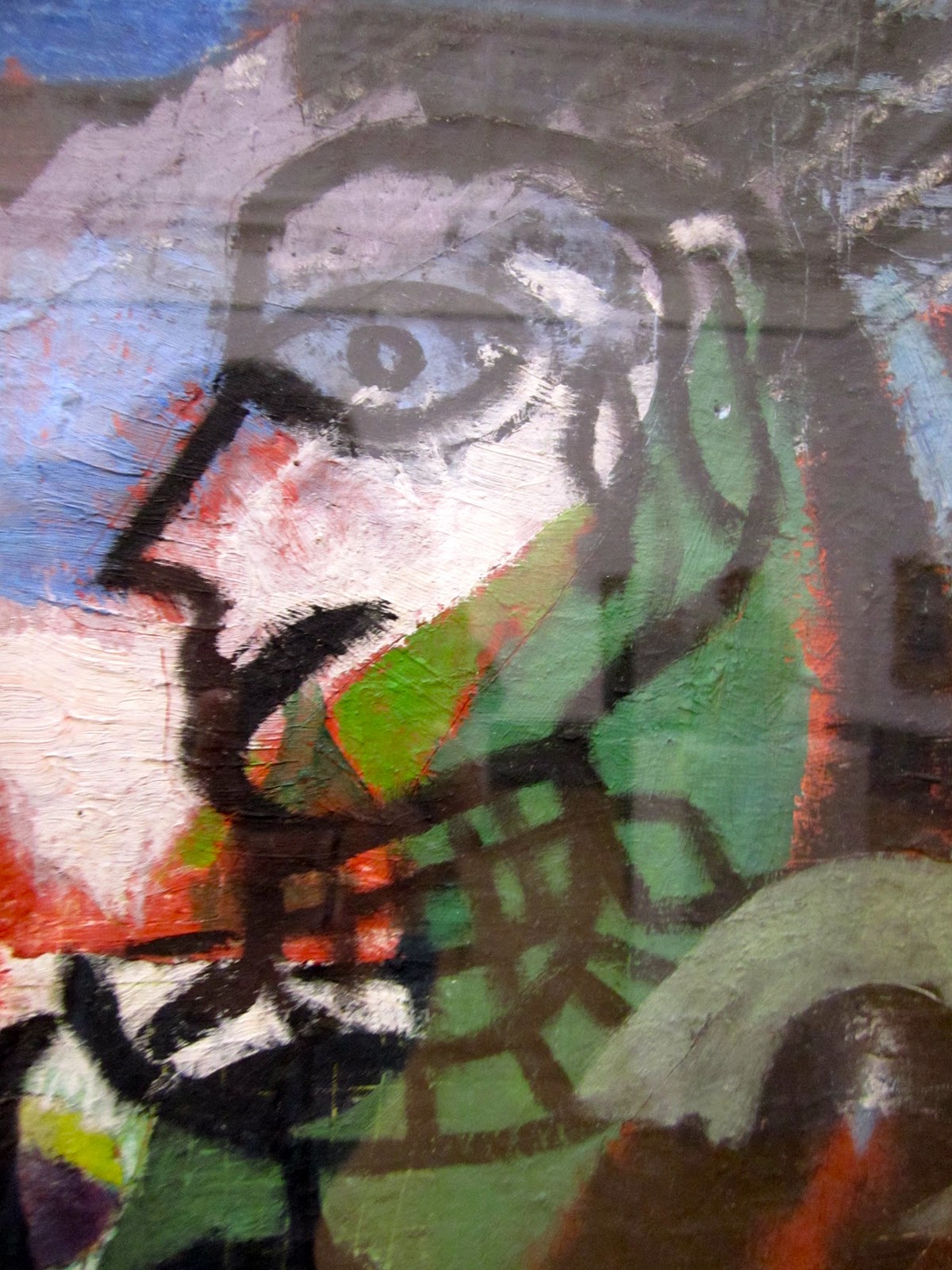
A face from the fourth portion
This painting is called "The Autobiography of an Embryo" by Eileen Agar from 1933-4.  The painting is split into four parts.  I thought it was interesting because without knowing the title, I would have had no idea what this painting depicted.  But after reading the title, I was able to start to see the different stages of embryonic development loosely portrayed in the painting.  The painting mixes abstract shapes with discernible figures and fiction with reality. The first portion of the painting has alien-like figures, fish and a circular motif running through many of the objects in the first portion.  I believe the alien-like figure symbolizes the inability to recognize a human form in the initial stages of development and the fish stands for the water surrounding human embryos.  The second portion features multiple figures of people, which could be illustrating the possibility that this embryo could become any type of person.  The third portion has birds, horns, a headdress, a womb with a baby inside and mummies.  This could be the preparation for birth and a new life mirrored with death:  the circle of life.  The fourth portion is brighter and facial expressions and eyes can be seen on some of the figures' faces.  There are also explosion-like images and shapes, which could represent the birth. 
 I enjoyed this work of art because it was fun to try and imagine what Agar was thinking while painting the work.  Because it was partly abstract and contained four parts, it held my attention for a long time and each second I found something I had not seen a second before.