
The logo for London's Science Museum is comprised of all capital, sans serif lettering. It utilizes cut corners and disconnected appendages. Each of the two words are split in half so as to fit on four lines instead of one or two so the logo creates a rectangular shape. Although the logo catches people's attention because of its unique letter distribution, it is hard to read. The letter styling is inconsistent, with the first 'E' missing its spine, and the subsequent two having spines. The letters are blue on a white background. The Science Museum caters to families and children in particular with its hands-on, interactive exhibits. The inside of the museum, as well as all related paperwork, includes bright colors, such as turquoise, hot pink, bright orange, lime green and purple. But the logo is harsh, lacking any rounded corners or vibrant colors. The white background of the logo seems sterile and uninviting, while the blue used for the lettering is muted and boring. Although the sterility of the background may align with the traditional view of science, it does not attract children, the primary museum audience. The shape of the letters in the logo is unique and original, like many of the exhibits in the museum, but its minimalism and illegibility do not function to extend the museum's inviting and child-friendly atmosphere.


The museum paths and exhibits are clearly marked with colorful signs that include large lettering and arrows. Exhibits are clearly market with title walls, including themed arches over the door to the exhibit. There are several paths to get to many of the exhibits and they are all indicated by signs and arrows. The colors on the signs are bright, such as electric blue and yellow, matching the rest of the upbeat interior. The map is easy to read and includes numerous picture symbols and keys. Each floor on the map has a different color background that helps illustrate different areas and exhibits. However, some of the exhibits on either end of the museum on the upper floors are difficult to find because they require the use of specific elevators or stairwells. For example, to get to the fourth and fifth floors, a visitor must get to the third floor and then transfer to a specific central elevator or stairwell to ascend. This is clear once you reach the third floor and see signs for these exact elevators. However, on the first two floors of the museum, no signs indicate why the elevators do not go beyond the third floor.

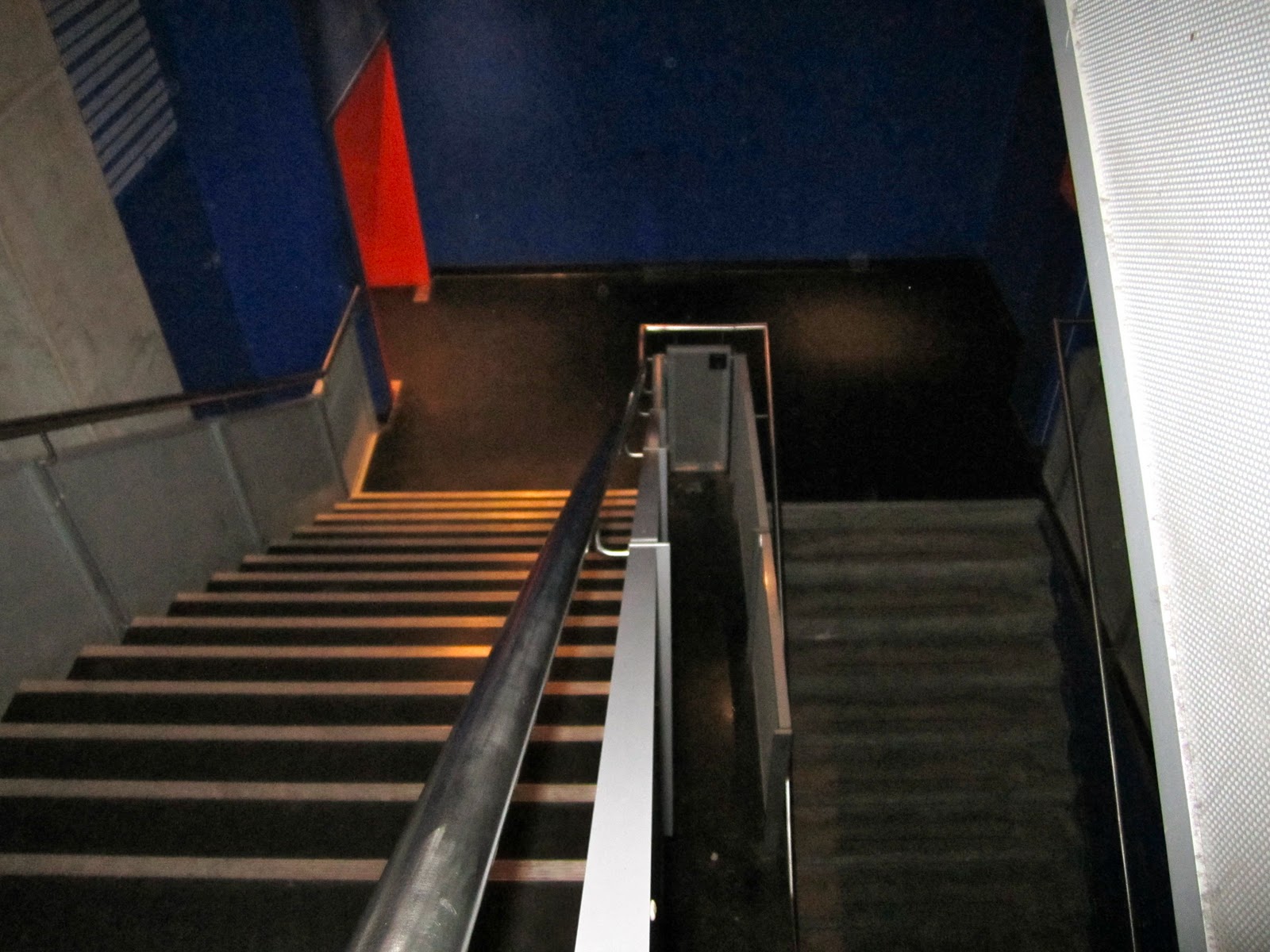
All of the signs, maps and handouts are attention-grabbing and interesting for children to look at, but the stairwells lack originality. They are generic and could be found in any normal building. The museum should carry their exhibits or at least their use of bright colors throughout the stairwell so visitors can continue their unique experience when traveling between exhibits.


The cafes and shops help extend the brand of the Science Museum by featuring colorful signs and kid-friendly menu items and eating areas. The downstairs cafe is a well-lit, bright, clearly marked area indicated by a large orange menu sign. The menu items appeal to both children and adults attending the museum, including sandwiches, desserts, lemonade and coffee. The font in the cafe is unique, like the logo, but much easier to read because it has continuously connected letters. The purchasing areas are easy to maneuver and separated into food categories. The eating areas accommodate large numbers of people and are easy to clean, which allow children to roam more freely and be less inhibited. The shops use the same text as the cafes, a friendly, more-rounded letter compared to the museum's logo. The shop helps extend the brand of the museum because it appeals to all types of visitors and includes many products that feature the museum's name and logo. The shop has educational toys for kids and objects that can be tested in the store, such as bouncy balls and boomerangs. The store also has items that appeal to adults, such as static-free laundry inserts and books. The museum shop contains items with the museum's logo which acts as free advertising for the museum and an extension of the brand to anyone who sees the item out of the confines of the museum.


Display cases throughout the museum generally function as protection. When an item is completely enclosed in glass it's because it is smaller and more detailed or fragile so it must be viewed up close but should not be touched. When items are larger but cannot be touched, they are generally kept behind short iron railings. Items enclosed in glass have placards inside the glass case whereas objects behind iron railings generally have text panels with more elaborate descriptions and pictures in front of the railing. Items behind short railings are more inviting because there is not an obvious separation between the exhibit piece and the viewer. However, items behind railings are generally farther away from the visitor than items inside glass cases. Items in glass cases are inches behind the glass, as opposed to feet behind railings, and can be examined closely and in detail. Items not enclosed in any way are the most interesting because the visitor can experience and use the item and therefore establish a greater connection to it.

 |
| Iron Lung |
I was surprised by how much there was to see at the Science Museum. The exhibits varied greatly in their subject matter ranging from innovations in fashion to equipment used in ancient Mesopotamian medicine. The exhibit that stood out most was one called "Health Matters," featuring innovations in medical technology during the 1900s. The colors in the exhibit were muted red, green and purple backgrounds with white text. The exhibit featured a lot of interesting textual information, but it was so dark inside the room, the text was hard to read. The exhibit was small compared to the medical exhibits on the upper floors because it featured a few larger machines over numerous smaller objects. It was easy to follow the exhibit because it was a single path with objects on both sides. Many of the exhibits had instructional voices that would all speak at the same time so you could not hear a single one clearly.
The sheer amount of text in the exhibit paired with the lack of light made it difficult to discern much of the text. However, this was my favorite exhibit in the museum based on content. I was amazed by how much medical technology had advanced in such a short amount of time. One machine called the "iron lung" (captioned above), breathed for people who had become paralyzed due to polio. The machine was made by car factories between 1938-1950 and required people to spend their entire lives in them because they could not survive outside of the machine. These machines were replaced by ones that allowed people to live more normal lives and eventually by the polio vaccine, but our grandparents and some of our parents were alive when iron lung was being used. This particular exhibit resonated with me because many of the diseases the machines treated were ones my generation had never experienced. It was also interesting to compare the sizes of the machines in the exhibit with similar machines today. Many of the machines were heavy and cumbersome, while many machines today are light and flexible.


The fashion exhibit was also interesting because I did not know there was an industry revolving around using recycled materials and trash to design more environmentally-friendly or biodegradable fashion. I also just thought this dress looked really cool.
I found this experience amusing because I had never before visited a museum and paid attention to consistency between the museum's mission, branding, exhibits and signage. I did not realize how hard it would be to keep up a brand, especially in places like bathrooms and stairwells that are often frequented by patrons but ignored by exhibit designers.


No comments:
Post a Comment