 |
| From: Museums: Branding and History |
The logo is extremely plain compared to the contents of the museum. The logo uses a generic serif font in plain black. The museum houses famous artists, such as van Gogh, and the logo does not reflect any of these collections. The logo is just a typeface and is extremely boring. The museum should take inspiration from its collections to create a more unique typeface and a logo that includes a symbol. The museum should include the symbol on all of its promotional material and banners. Eventually the symbol can stand alone and will become representative of The National Gallery without always displaying the title of the museum. The new logo should include an interesting, artistic font and vibrant colors. An art museum is one of the few entities that can be creative with their logo without it looking cheesy or unnecessary. The logo should elegantly reflect collections and mimic colors and lines; it should not be a generic font in black.
 |
| From: nationalgallery.org.uk |
 |
| From: nationalgallery.org.uk |
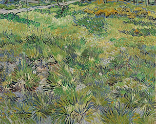
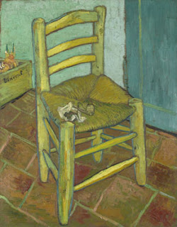
I think the van Gogh paintings live up to their position in art history. They are all so detailed, with slight variations in colors used to create depth. For example, "Long Grass with Butterflies" appears as though it is jumping off the canvas. Van Gogh uses many different types of greens to create the colors in the grass. The painting displays each blade of grass separately, which illustrates van Gogh's effort in producing the painting. The butterflies are small and delicate, requiring the viewer to search for them within the painting even though they are in the title of the work. Van Gogh's importance is evident in his ability to paint a wide range of subject matter. "Long Grass with Butterflies" is happy and serene, using bright colors to display a landscape. "Van Gogh's Chair" uses darker colors, such as dull blues and golds, and is haunting. The painting uses extreme detail in the seat of the chair's fibers and the tiles on the floor. The pipe left on the chair indicates a loneliness in the painting as though someone got up and left the room without bothering to take the pipe with them. It is interesting that two of his paintings can evoke such different emotions.
 |
| From: nationalgallery.org.uk |
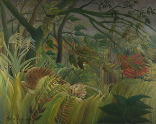
My object of desire is Henri Rousseau's "Surprised!" I chose this painting because it made me laugh when I first saw it. The tiger looks as though it is smiling and has complete control of the jungle around it. The tiger seems like it knows something others around it does not and is going to prove it to them. I also like how cheesy it is. It is a huge painting of a jungle with a massive lightning bolt in the background and a weird looking tiger in the foreground. I would love to put it over the fireplace in my cottage. I think having a crackling fire under the painting and looking up to see the jungle and tiger would create an amusing combination that would make people ask why I want this painting.
The bright colors of the walls in The National Gallery both enhance and distract from the art. In certain rooms that include paintings of religious imagery with huge, ornate frames, the colors of the walls help pick up colors in the painting. This makes these religious paintings seem even more important and beautiful. For example in one room, the wall color was a deep purple and many of the paintings had purple in them. This helped pick out the details in the painting and make the painting seem crisper. But in rooms that have simpler paintings of delicate flowers and landscapes, I think the wall colors are distracting. In these rooms, white walls would have been more appropriate because the colors distract from the subtleties in the paintings.
I don't think creating merchandise that includes pictures of famous artworks diminishes the art. Although people can see the art on the merchandise, it is not as impressive as seeing the artwork in real life. If people want to carry around a bag with van Gogh's paintings on it, there is no reason they should not be able to enjoy the work of art even when they are not inside a museum. In addition, the Internet allows people to see almost anything when they are sitting at home on their computer. Since people can see the paintings out of the museum on their computer, it is the same as seeing the painting on an umbrella or tote bag. I think postcards and posters do the work of art more justice, since they best recreate the original work of art. Postcards and posters are flat and often depict the entire work, whereas an umbrella will distort the work and may only portray part of it.
 |
| From: nationalgallery.org.uk |
I think one of the most beautiful paintings in the museum is Dosso Dossi's "The Adoration of the Kings" painted during the late 1520s. I think the rich colors in it are beautiful and the contrast of the night and the rising sun in the background add to the richness. The delicate crowns that the mother, father and baby are wearing are very interesting and do not look like traditional royal crowns. The painting is whimsical, but depicts a strange scene. There is a contrast between the crowns and relaxation of the father figure with the worried expression on the mother's and baby's face. It looks as though the family is hiding from something and is worried they might be found. There is a castle in the distance, but I am not sure whether the family is heading toward it or running from it.


No comments:
Post a Comment